The first blossoms of spring don’t just make everything look pretty – they shift the appearance of the online marketplace.
And brands that understand the power of seasonal colour psychology gain a significant edge in capturing attention and driving engagement. This alignment of visual identity with seasonal shifts influences consumer behaviour in powerful ways!
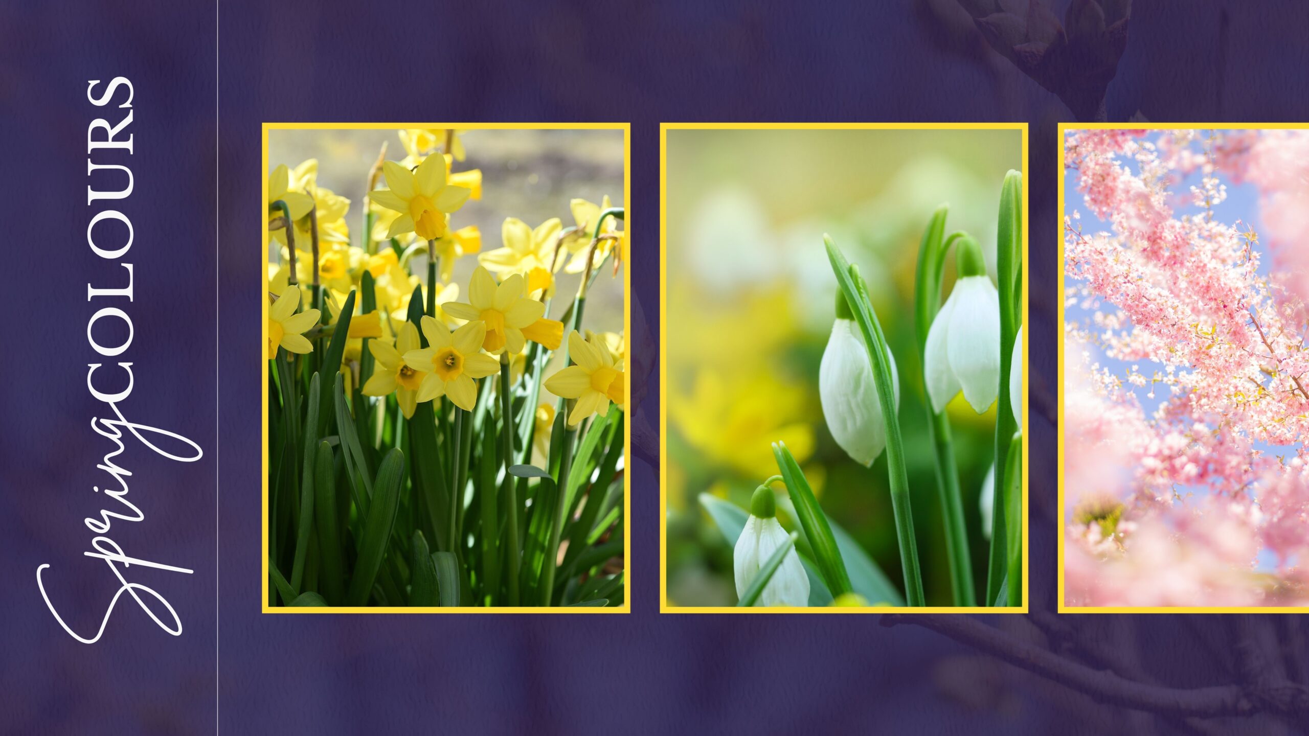
The soft greens of new growth, delicate pinks of cherry blossoms, energetic yellows of daffodils, and clear blues of brightening skies trigger specific emotional responses in consumers. These aren’t arbitrary associations—they’re deeply embedded connections that link spring colours to feelings of warmth, optimism, and fresh beginnings.
This blog explores how you need to be incorporating spring’s distinctive colour psychology into your seasonal marketing efforts. Let’s get into it…
The Science Behind Spring Colour Psychology
The human brain responds distinctly to spring’s colour palette – a response shaped by both biology and culture. After winter’s darkness, we’re naturally drawn to spring’s lighter hues that signal growth and new beginnings.
Soft Greens
The quintessential spring colour represents renewal and fresh starts. These gentle verdant tones reduce anxiety while promoting feelings of health and vitality. Brands using soft greens connect with consumers’ desires for growth and rejuvenation, creating associations with natural goodness and new possibilities.
Gentle Blues
Spring’s clear blues evoke expanding skies and fresh air. Psychologically, these hues promote mental clarity. They build trust through associations with openness and reliability, making them effective for brands wanting to communicate transparency and dependability.
Pastel Yellows
These soft sunny tones directly impact our mood by stimulating serotonin production. Pastel yellows create optimism without overwhelming the senses. Brands using these colours effectively communicate warmth and accessibility, generating a subtle emotional lift that consumers unconsciously associate with their offerings.
Light Pinks
Reminiscent of early blossoms, spring’s delicate pinks engage our nurturing instincts. These hues reduce stress while promoting empathy and compassion. Brands employing light pinks connect through gentleness rather than assertion, making them particularly effective for products focused on wellness, beauty, and emotional well-being.
Spring Colour Trends for 2025
Spring 2025’s colour landscape is being dominated by one particular shade that has captured both designer attention and consumer imagination: Butter Yellow. This warm, soft yellow with subtle creamy undertones has officially been declared the Colour of the Year for 2025 by KitchenAid.
Butter Yellow represents the current consumer desire for comfort combined with optimism. Its subtle warmth evokes nostalgia while still feeling contemporary, making it exceptionally versatile across industries from fashion to home decor.
The shade strikes a perfect balance between statement and subtlety, allowing brands to refresh their seasonal offerings without alienating more conservative consumers!
Beyond Butter Yellow, complementary trends include:
- Earth-toned greens that pair harmoniously with the featured yellow
- Soft periwinkles that provide cool contrast
- Grounded neutrals: Warm off-whites, soft taupes, and gentle greys with subtle undertones provide breathing space in a world of constant stimulation.
As you plan your spring campaigns, incorporating Butter Yellow—even as an accent—will help create immediate visual relevance with trend-conscious consumers while still maintaining broad appeal.
Colour Psychology: Your Guide
Finding the right spring colour palette for your brand requires balancing seasonal relevance with brand consistency. Begin by examining your core brand colours and identifying potential spring adaptations that maintain your visual identity. Consider these approaches:
- Lighten existing brand colours: Create Spring versions by adjusting saturation and brightness
- Expand with complementary spring tones: Add seasonal colours that work harmoniously with your primary palette
- Emphasise specific brand colours: If you already have Spring-appropriate colours in your palette, bring them forward temporarily
It’s key to find the right balance so that your brand guidelines and appearance don’t suffer.
Need help bringing your spring vision to life? At 10X Marketing Consultancy, we specialise in social media marketing, making us well equipped to create impactful graphics that capture the essence of your brand.
Let us help you design visuals that bloom this spring!
Did you know that we continuously upload free downloads and resources to help you with your marketing efforts? Take a look here.