Ever landed on a website and thought, “Is this the same company I saw on Instagram?” Maybe the logo’s different, the colours clash, or the whole vibe just feels… off. This inconsistency isn’t just a minor detail; it can seriously undermine your new business. Imagine receiving an email that looks nothing like your social media or website – it feels unprofessional, doesn’t it?
That’s why branding consistency is absolutely crucial. It’s more than just having a nice logo; it’s about creating a cohesive visual language that speaks volumes about your business. Here’s why it matters:
- Professionalism: Consistent visuals scream “we’re serious about what we do.” It conveys trustworthiness and an attention to detail that builds confidence.
- Brand Recognition: Think of iconic brands – you instantly recognise their colours, fonts, and even patterns. Repeated exposure to consistent graphics makes your brand easily memorable.
- Brand Identity: Your visuals are a powerful way to communicate your brand’s personality, values, and overall message without saying a word.
- Customer Trust: A unified and professional appearance builds confidence and trust with your audience. It shows you’re organised and reliable.
- Marketing Effectiveness: When your branding is consistent, all your marketing efforts – from social media posts to printed materials – work together to create a stronger, more impactful impression.
So, what are the key branded graphics you need to nail to achieve this consistency? Let’s take a look.
Your Logo
What it is: Your primary visual identifier. It’s the cornerstone of your brand’s visual identity.
What it should include:
- Versatility: Your logo needs to be adaptable. It should look good on your website, printed on a flyer, and as a tiny social media profile picture.
- Memorability: Aim for something unique and easy for people to recall. A clever or distinctive design can stick in people’s minds.
- Relevance: Subtly hint at your industry or brand personality. A tech company might use sleek, modern lines, while a children’s brand might opt for something more playful.
- Simplicity: Often, less is more. A clean and simple logo tends to be more timeless and easily recognisable.
Variations: Having different versions of your logo is essential for flexibility:
- Horizontal/Landscape: Perfect for website headers and banners where you have more width than height.
- Vertical/Stacked: Ideal for social media profile pictures and tighter spaces where a tall format works better.
- Icon/Symbol: A simplified version of your logo or a key element that can be used for favicons and app icons.
Logo Stamp/Favicon: A favicon is that little icon you see in your website browser tab. Often, a simplified element from your logo or your brand initials works brilliantly here for instant recognition.
Brand Pattern (Optional but Powerful):
What it is: A repeating visual element that draws inspiration from your logo, brand colours, or other brand assets.
What it should include: Keep it subtle and recognisable. The aim is to reinforce your brand without being overwhelming.
Where to use it: Think website backgrounds, packaging designs, and as a subtle element in your social media graphics.
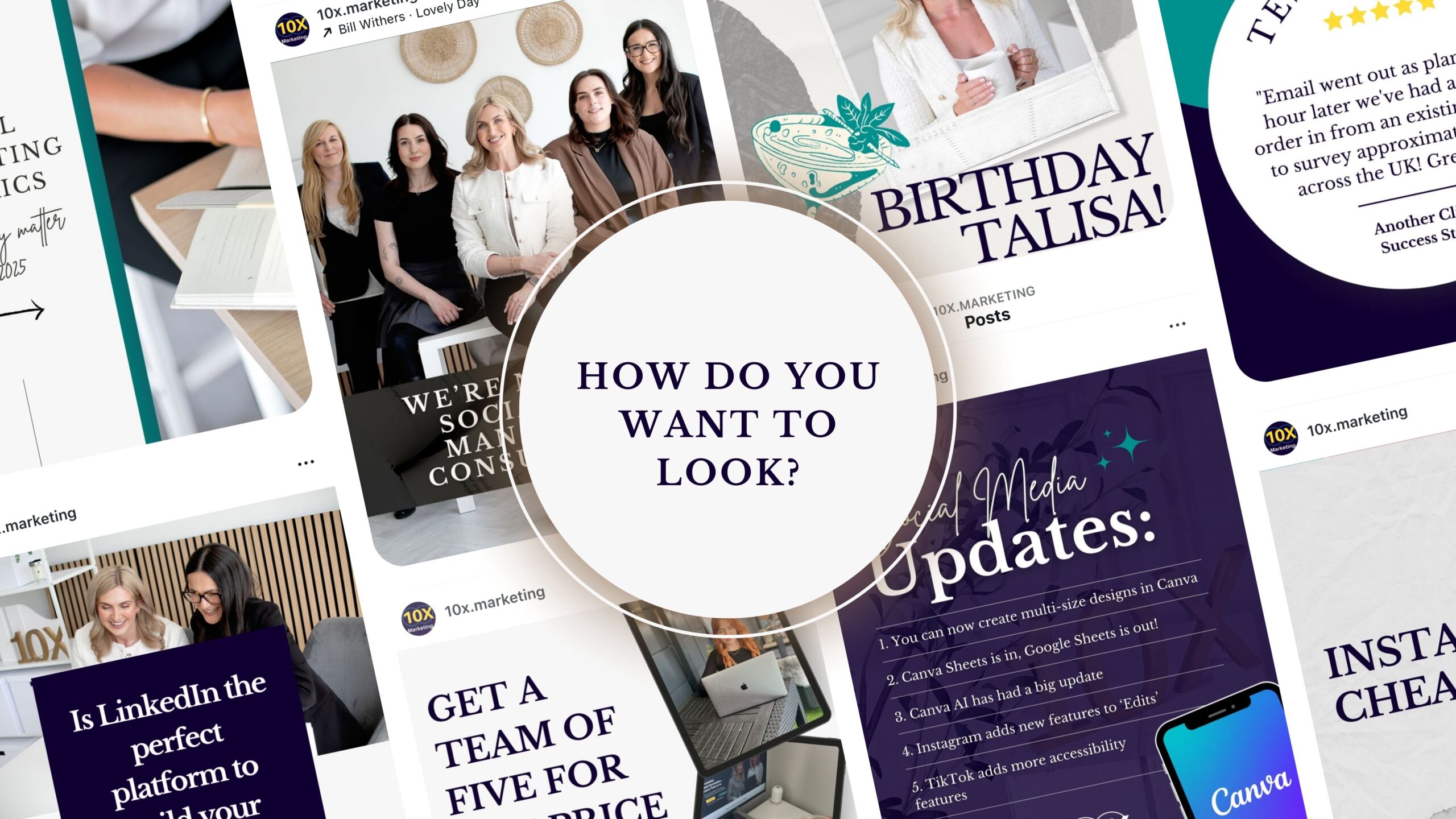
Making Your Mark Online – Social Media Banners
What they are: The large, prominent images that sit at the top of your social media profiles. They’re prime real estate for showcasing your brand.
What they should include:
- Platform-Specific Dimensions: This is crucial! Each platform has different size requirements, so make sure your banner is designed to fit perfectly on Facebook, X (formerly Twitter), LinkedIn, and YouTube without getting cropped or distorted.
- Brand Elements: Incorporate your logo (or a variation), your brand colours, and your brand fonts to maintain consistency.
- Key Information (Strategically): Depending on the platform and your current goals, you might include your tagline, website URL (if space allows and it’s relevant), or highlight current promotions or events. Remember, you can update these banners.
- Visually Engaging Imagery: Use high-quality photos or illustrations that reflect your brand’s aesthetic and appeal to your target audience.
- Consistency: Your social media banners should feel like a natural extension of your overall brand identity.
Tips for Effective Banners: Keep text to a minimum to avoid clutter, focus on strong visuals, and always ensure your text is readable, especially on mobile devices.
Professional Communication – Email Signatures
What they are: The block of text and sometimes graphics that automatically appear at the end of your business emails. They’re a simple yet effective way to reinforce your brand in every communication.
What they should include:
- Your Name & Title: Clearly state who you are and your role within the company.
- Company Name & Logo: Reinforce brand recognition with a small, clear version of your logo.
- Contact Information: Include your phone number, email address, and website URL so people can easily get in touch.
- Social Media Links (Optional but Recommended): Encourage connection on other platforms by including small, recognisable social media icons.
- Professional Design: Keep it clean, easy to read, and consistent with your brand’s visual style. Use your brand colours and fonts sparingly and effectively.
Keep it Concise: Avoid overwhelming the recipient with too much information or lengthy disclaimers.
Leaving a Lasting Impression – Business Cards
What they are: Small, physical cards containing your essential business contact information. In today’s digital world, they remain a vital tool for networking and making a tangible connection.
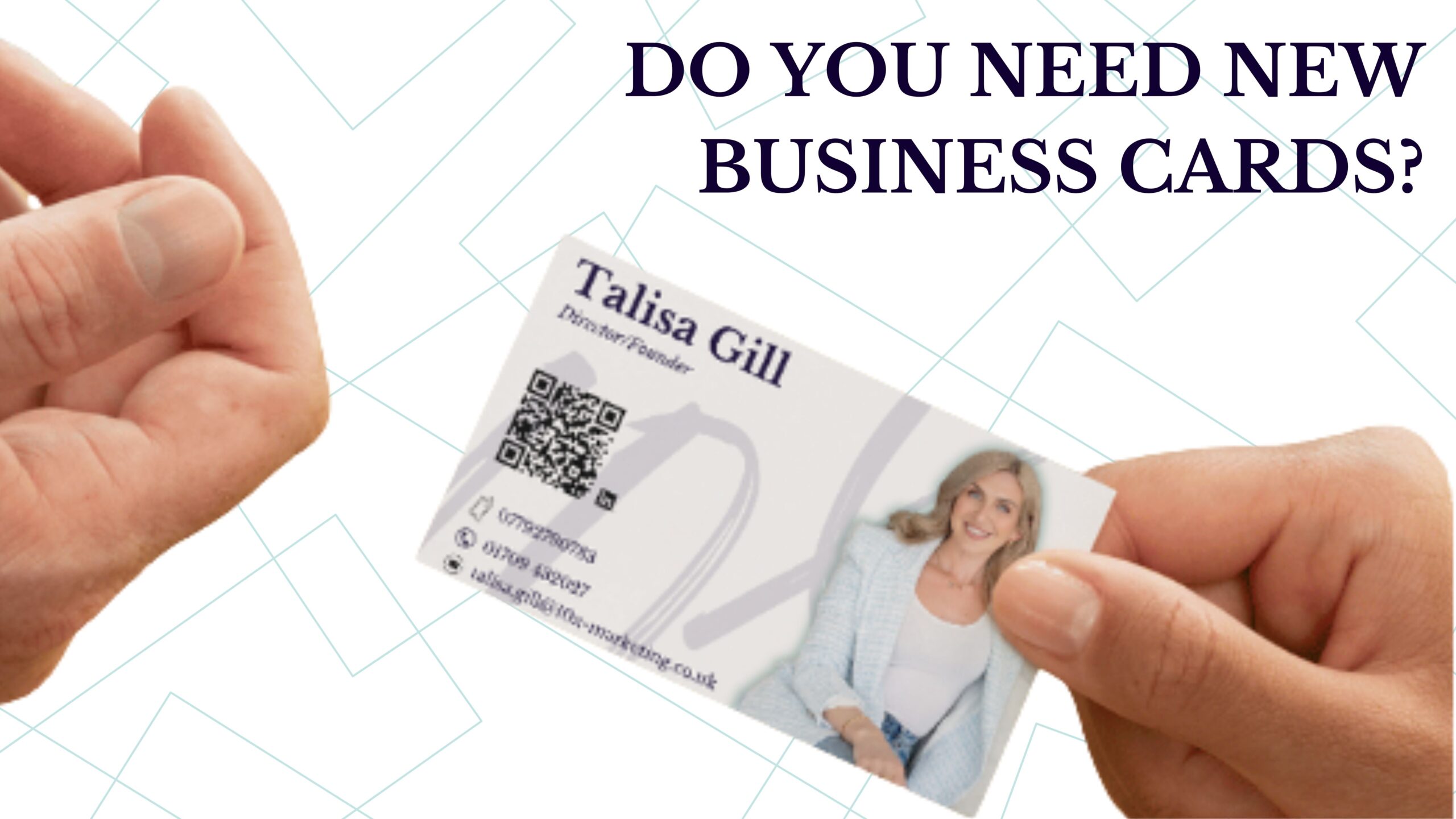
What they should include:
- Company Logo: Display your logo prominently.
- Your Name & Title: Make it clear who you are.
- Contact Information: Include your phone number, email address, and website URL.
- Brand Colours & Fonts: Maintain consistency with your overall visual identity.
- Clean and Uncluttered Design: Prioritise readability. Don’t try to cram too much information onto the card.
- Optional Elements: You might consider including your tagline or a QR code that links to your website or LinkedIn profile.
It’s An Investment – Trust us!
Investing in well-designed branded graphics is an investment in your business’s future.
Consistency across all these visual touchpoints – from your logo to your business card – builds a strong, recognisable, and trustworthy brand. Prioritising these essential graphics will help you establish a professional and impactful presence, setting you apart from the competition.
Need help creating a cohesive set of branded graphics that truly represent your business? Our design team is here to help! Get in touch today to discuss your visual identity.